This portfolio was designed as a desktop OS. Open on a laptop for the full experience.
Profile — Alice.md
Lead Senior Product Designer · Paris · 10 years
Design with intent.
Every pixel argues for attention. Most should lose.
Design is a methodology before it's a craft. A transversal tool that helps companies make better decisions, build the right things, and create experiences that actually stick.
I've been doing this for 10 years across a lot of B2B sectors: FinTech, BI, video, construction work, knowledge management, telecoms and more. Lead roles, management, IC, teaching. The domain changes but the approach doesn't.
01 — Vision
Design is a differentiator
Design is a differentiator, not a delivery function. Design at the execution stage is too late. UX is what people live with every day. That's not where you cut corners.
02 — Duality
Sharp and flexible
You need to sit with the problem long enough to actually understand it. Then cut to the chase and defend the direction. Explore deeply. Decide sharply.
03 — Learning
Student and master
You're never one or the other. If you can't explain it, you don't understand it. I enter a domain, learn it until I can teach it, and stay curious enough to keep being wrong.
Read more on a laptop
Experience — Alice.cv
10 years across BI, FinTech, telecoms, media.
2025 — Now · FinTech SaaS
Pennylane
Lead Senior Product Designer
Lead designer on the most complex part of accounting: how ledger entries are understood, managed, closed. Unlocking new AI-driven use cases. Working as a troika with PM + EM, full strategic ownership across a 6-dev squad.
Outcomes
2 hours/day saved on manual bookkeeping
75% → 0% timeout rate on the new flow
2023 · 2 years · BI · e-commerce
Polar Analytics
Lead Product Designer · Design Manager
Hybrid role: lead designer on acquisition (new features, new use cases unlocking revenue) plus design manager of 2 designers. Owned the work end-to-end, from product strategy through execution. Shipped AI Personas and the Privacy Crisis migration that reframed Polar's positioning from 'another BI tool' to 'make data actionable.'
Outcomes
$157K new + $96K upsell from AI Personas
~$2M in attributable deal value from Privacy Crisis
Access full case study on a laptop:
AI PersonasPrivacy Crisis
2022 · 9 months · Video · Analytics
Dailymotion
Senior Product Designer
Contributed to the analytics platform serving creators across video discovery and monetization.
2021 · 7 months · Construction · SaaS
Kraaft
Lead Product Designer · Sole Designer
Sole designer at an early-stage construction SaaS. Built the app as a source of truth, consolidating field knowledge and practice into something searchable and actionable.
2020 · 1.5 years · Telecoms · B2B2B
Netwo
Lead Product Designer · First Designer
First designer. Built the design system from scratch and shipped the MVP for a highly complex B2B2B telecom marketplace covering offer, resell, eligibility, deployment, and support. Scaled the team from 1 to 6 designers in a year, with foundations I built.
Outcomes
4 operators listed on the marketplace in a 3-week beta
8 contracts ran through end-to-end
Read more on a laptop
Side practice — Side.md
2021 → 2024 · Teaching
ECV & ESD
Lecturer · UX Master's · 4 cohorts
Taught UX Master's students across 4 cohorts. Affordance, product strategy, design systems, user research, and a semester-long project: shipping a new feature into an existing product, end to end.
2024 · Mentoring
ADPList
Super Mentor · Top 1%
Top 1% mentor on the global ADPList platform. 1:1 sessions on portfolios, career strategy, design ops.
Every pixel argues for attention. Most should lose.
Design is a methodology before it's a craft. A transversal tool that helps companies make better decisions, build the right things, and create experiences that actually stick.
I've been doing this for 10 years across a lot of B2B sectors: FinTech, BI analytics, video, construction work, knowledge management, telecoms and more. Lead roles, management, IC, teaching. The domain changes but the approach doesn't.
I'm looking for a team where design has a real seat. Where the problem is worth solving and there's room to do it right.
01 — Vision
Design is a differentiator
Design is a differentiator, not a delivery function. Design at the execution stage is too late. UX is what people live with every day. That's not where you cut corners.
02 — Duality
Sharp and flexible
You need to sit with the problem long enough to actually understand it. Then cut to the chase and defend the direction. Explore deeply. Decide sharply.
03 — Learning
Student and master
You're never one or the other. If you can't explain it, you don't understand it. I enter a domain, learn it until I can teach it, and stay curious enough to keep being wrong.
04 — Leadership
Lead by doing
I've managed senior designers and mentored UX students. I believe you lead by doing, not by directing. The goal is a team that's better because you were in it.
05 — Process
Pre-shape before research
I don't go into research with an unclear signal. Before any user session, I read the product, the data, the forums, the benchmarks. I walk into a room where users feel I already understand their problem. Research validates hypotheses — it doesn't replace having them.
06 — Craft
Earn your design system
A design system is a solution to a problem you have to earn first. Building one before you know what to rationalize is expensive and fragile. Impact is the measure. Not the radius.
She helped build design ops: career ladder, training, design system advocacy. An insightful strategic designer who won't shy away from defending what she thinks is right.
Des cours vivants, enthousiasmants, ambitieux, tout en restant connectés aux réalités du terrain. Une richesse d'échanges et une prise de recul oxygénante.
Polar Analytics · Scale-up · 2025 · Lead + Manager
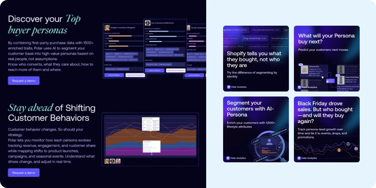
AI Customer Personas
Polar already knew the numbers. This feature added the people behind them. Demographic and behavioral context that turns BI data into marketing decisions, activatable directly in marketers' stack. Built end-to-end: user research, strategy, design, beta, sales materials, marketing.
$96K
Upsell in 2 months
$157K
New deals closed (2 months)
43%
Of upsells over 6 months
Product strategyUser researchData vizGrowth
"The data knew what they bought. We built the tool that knows who they are."
01 — General context
Polar Analytics is a business intelligence platform built for e-commerce brands (particularly Shopify merchants) to centralize their data across marketing, sales, and operations. Its core value lies in providing real-time insights from tools like Shopify, Klaviyo, Meta Ads, Google Ads, etc., in one dashboard.
Historically, Polar (like most BI tools) focused on quantitative, transactional data such as:
—Revenue
—Orders
—CAC, ROAS
—LTV
—Retention cohorts
It's incredibly powerful, but largely answers the question: "What happened?"
Transactional data tells you what people did. But not who they are or why they did it. Both are key questions if you sell online.
02 — Identified problems
"I know what they buy, not who they are." Brands using Shopify or Polar could see basic customer data like purchase history, AOV, retention, but not the why behind buying behavior.
Over-segmentation fatigue, underperformance in campaigns. Email and ad platforms like Klaviyo or Meta offer basic segments (e.g. high spenders, recent buyers), but without deeper audience insight, personalization efforts often fall flat or feel generic.
Manual, disconnected workflows. Marketers often had to export data, enrich it elsewhere (via surveys, data vendors, or guessing), then upload it again to Klaviyo or ad platforms, creating friction, lag, and room for error.
Inability to adapt fast. Campaign performance could shift based on seasonality, product changes, or cultural trends but existing segments were static, and updating them required manual effort and intuition.
03 — Identified needs
Deeper customer understanding, instantly. Customers needed a way to go beyond RFM (Recency, Frequency, Monetary) data and see who their buyers are: interests, lifestyles, demographics. Without becoming a data scientist.
Smarter segmentation that evolves over time. Marketers wanted personas that update themselves based on live data, so they can adapt strategies without starting over every quarter.
Seamless activation across tools. They wanted to use insights where they take action (email tools, ad platforms, landing pages) without juggling CSV files or switching tools.
Better ROI on paid and owned marketing. With increasing ad costs and fatigue in email channels, the pressure was to improve precision: send fewer, better messages to the right people, instead of blasting everyone.
04 — Opportunity & strategy
Personas could transform raw purchase history into rich audience segments by combining first-party Shopify data with demographic, lifestyle, and behavioral traits such as income, shopping style, household size, and interests. This lets brands move from simple "high-spender" groups to true human profiles ("fitness lovers," "young families," etc.) and track how these groups evolve over time based on campaigns, seasons, and product launches. These WYSIWYG segments can then be activated across marketing platforms like Klaviyo, Meta, and Google Ads.
Polar would move from a reporting tool to an actual growth tool. It positions itself as not just a source of truth for analytics, but a source of leverage for marketing performance. Helping brands act on insights, not just see them. This makes the product more embedded in day-to-day marketing decisions and harder to churn.
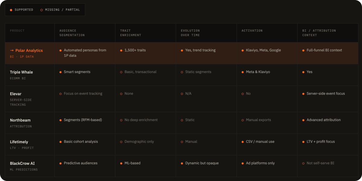
Compared to competitors: more actionable than traditional BI (Northbeam, Lifetimely), richer insights than native marketing tools (Klaviyo), and more transparent and self-serve than AI-first platforms (BlackCrow).
Competitive bench: where Polar stands across audience segmentation, traits, evolution, activation, and BI context
05 — Design principles
01 — Storytelling
People behind a purchase
This is not just a feature. It's a story about the people behind a purchase. Users need to understand in one page: who's buying, what they buy, how much, how often, and from where.
02 — Actionability
Design for action
Users need more than insights. They need to do something with them. Making segments instantly usable turns analytics into outcomes. A seamless loop: insight → action → result. Rare in analytics tools.
03 — Human layer
Not transactions anymore
This is not just about personas. It's a new way to read your analytics. It's not about transactions. It's about people.
06 — User research
I interviewed 4 customers using a first draft as a discussion starter. I wanted to better understand what they wanted to see and how I could tell the best story about their data.
I had a structured framework of questions across 4 themes: current situation, goals, challenges, and integration & data sources. Sessions were recorded and shared with the team.
Ashley Kick, VP of ecomm at Doen (clothing brand): Currently using direct mail providers and buying prospecting mailing lists from Epsilon. She wanted to better understand customer profiles from personas: purchase behaviors, from where, when, how much, and what are they more likely to buy. She wanted to adapt product strategy to make sense according to personas analysis (trend products vs core products). She also mentioned: "I'd love to create a view in Polar from a persona. If we want to be a more younger brand, we'll know that this young mother is buying more of this, then we can market it and expand in those areas."
Key metrics that mattered to users: UPT (units per transaction), days in between purchase, first purchased product, Shopify tags ("promo shopper" vs "full priced shopper").
One user showed us how manual their reporting was. A Google Slides deck, built every quarter from exported data. That user became our beta tester.
Interview synthesis: clustered quotes and themes across the 4 sessions
07 — User tests & feedbacks
Before launch, we wanted to make sure the feature was answering 80% of our users' questions about personas. Theory in this field is never better than POC. We needed real data. We made a beta available free of charge for users willing to test it.
We got 5 beta testers from existing customers. After seeing results with real client data, we started the MVP: a landing within the app to show value and results, very simple approach.
After the success of those early customers wanting the feature, we planned for a full launch with self-onboarding and upgrade flows.
Key friction discovered: The persona names came directly from Faraday's clustering. Which gave names like "Glamorous Grandma Gloria" for the most profitable segment. We shipped editability immediately after the feedback. Faraday's data is not free. We offered a % of our sales to access the data, meaning users needed to pay before seeing results. We ended up opening the feature to a free trial because the in-app landing generated so many requests to unlock it.
08 — In-depth design
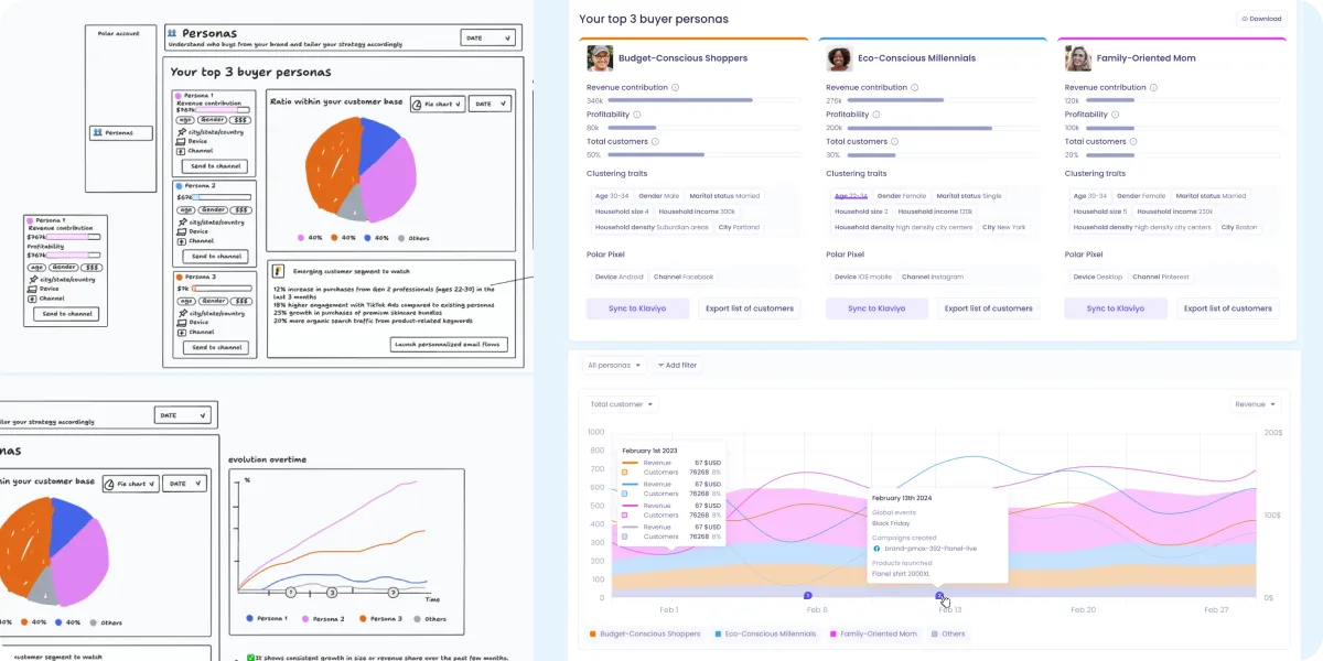
Top 3 buyer personas, first look
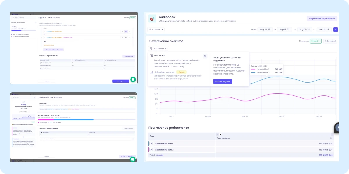
Users immediately see their top 3 buyers and how much they contribute to the business: revenue contribution, profitability, total customers share. A first layer of understanding who these people are. Each persona card shows clustering traits (age, gender, marital status, household income, household density, city), Polar Pixel data (device, channel), and direct actions: Sync to Klaviyo, Export list of customers. Personas also evolve over time, so users can see how campaigns, product launches, or seasonality shift their size and revenue share.
Top 3 buyer personas: revenue, profitability, clustering traits, activation
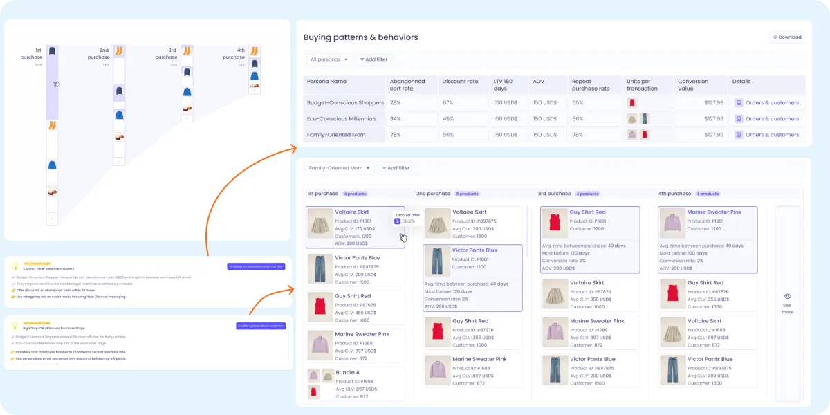
Buying patterns & behaviors
A cross-persona table showing abandoned cart rate, discount rate, LTV 180 days, AOV, repeat purchase rate, units per transaction, conversion value. All per persona. Plus the full purchase sequence: what they buy first, second, third, the time between, the drop-off. With Polar actionable insights showed up automatically, and a direct CTA to activate a Cart Abandonment Email Flow.
Buying patterns & behaviors: cross-persona table with actionable insights
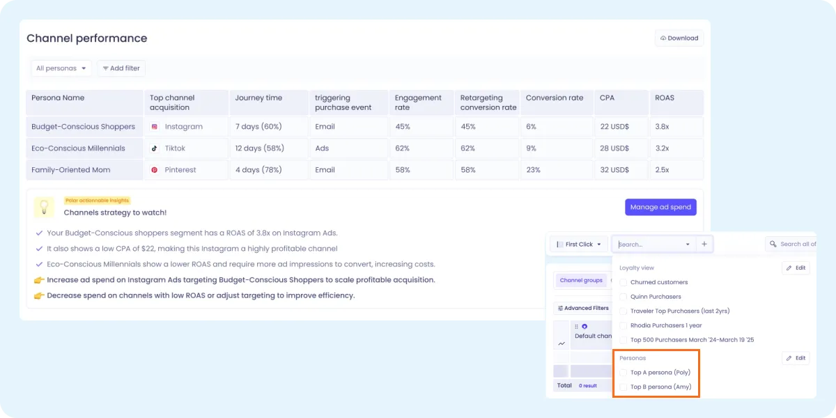
Channel performance per persona
Top acquisition channel, journey time, triggering purchase event, engagement rate, retargeting conversion rate, CPA, ROAS. All per persona. With AI-generated insights: which channels to increase spend on, which to cut. Direct action: "Manage ad spend." And because personas can be applied as a filter across every chart, cohort, and report in Polar, this same depth becomes available everywhere.
Channel performance: ROAS, CPA, journey time per persona with actionable spend recommendations
09 — Marketing & sales
The scope extended beyond the product itself. I also designed:
Pitch deck Used by sales in follow-up calls post-demo, covering the full buying journey by persona, with real client data for reassurance.
Privacy & compliance slide Addressing GDPR, CCPA, SOC 2 Type II, HIPAA concerns. Reassurance over compliance, not just a legal disclaimer.
Ads 4 formats targeting different angles: identity, evolution, AI persona, and purchase journey.
Outbound landing An independent landing page for outbound targeting indie ecomm brands, with a different tone than the core BI product.
Customer support help docs "Understanding Personas" documentation covering why personas, where the data comes from, 4 feature modules, and FAQs.
Pitch deck: product buying journey by persona
10 — Performance
$96K
Upsell in 2 months
$157K
New deals closed (2 months)
43%
Of upsells over 6 months
47
Calls from 2 newsletters
New potential customers acquired: 47 calls booked from newsletters mentioning personas (2 newsletters). Each deal was $5–20k. Range of potential revenue from those calls: $235k to $940k.
Slack: first upsell 3 days after beta launch. ARR from $4.2k to $13.2k.
Polar Analytics · Scale-up · 2024 · Solo designer end-to-end
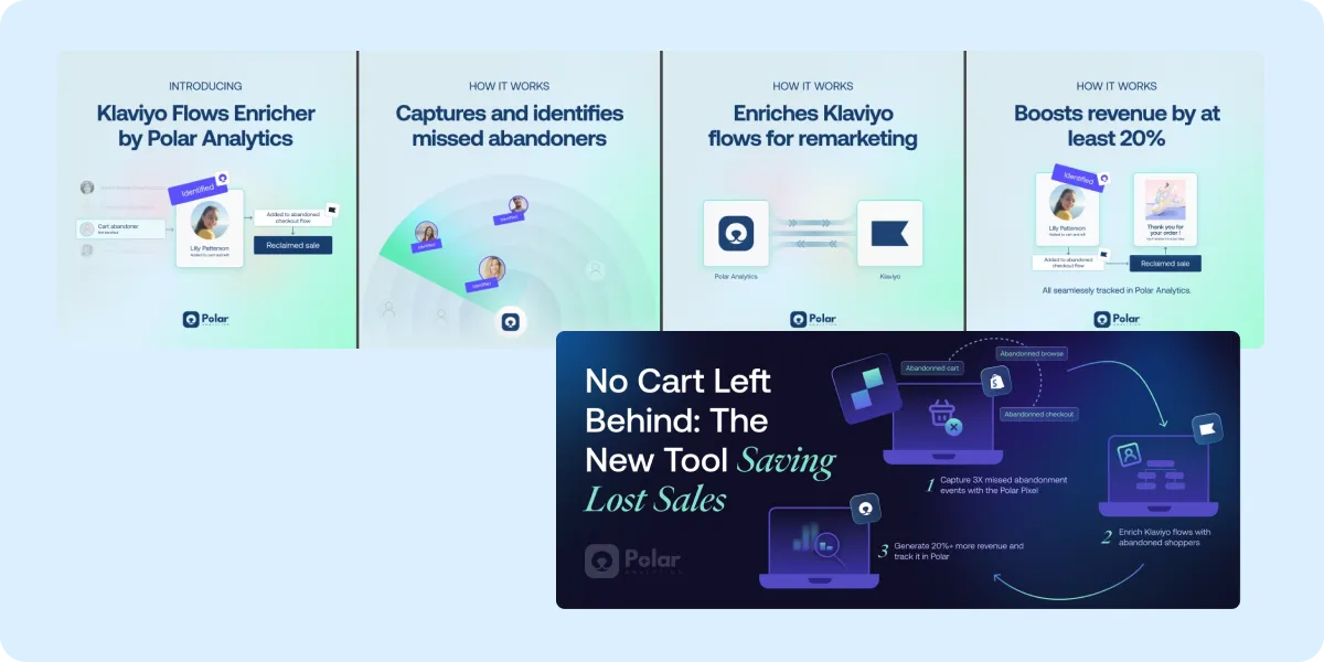
Privacy Crisis to Growth Engine
Apple's privacy changes silently killed 60–70% of Klaviyo tracking for every ecommerce brand overnight. Rather than patch around it, I shipped infrastructure: a server-side pixel, a cross-device identity graph, and a behavioral onboarding that turned a 10-day data ramp into a milestone journey toward "Polar pays for itself." POC, MVP, and full launch in 4 weeks.
What's more convincing to buy a product than a feature that directly makes you revenue?
01 — Context
In April 2023, Apple's privacy changes blocked most browser-based tracking unless users were logged in. Klaviyo relies on cookies and authenticated sessions. Overnight, it stopped capturing 60–70% of shoppers who visited a store, added to cart, or started checkout. Even people who had previously shared their email.
The result: brands were silently missing 20–70% of their potential abandoned-cart revenue. And every competitor (Omnisend, ActiveCampaign, Drip, Mailchimp) hit the same wall.
Polar Analytics already sat at the intersection of first-party data and ecommerce analytics, primarily as a BI platform for Shopify merchants. The Klaviyo Flows Enricher was a chance to use that infrastructure for something the BI product wasn't built for: directly recovering lost revenue. A natural, high-value entry point into the broader platform.
60%
Tracking lost overnight
20–70%
Potential revenue missed
0
Existing tools solving it
02 — Identified problems
Four friction points shaped the entire design approach.
No technical fluencyMost ecomm brands don't have in-house tracking expertise. The feature needed to explain itself without requiring it.
10-day data rampData takes ~10 days to accumulate after pixel install. Users could easily assume nothing was working and churn before seeing results.
Privacy anxietyConnecting a third-party system to a marketing platform triggers legitimate hesitation around data ownership and consent.
Multi-step setupThe feature requires several configuration steps inside a product users are still learning. Getting lost was a real failure mode.
03 — Identified needs
Each problem had a corresponding need that drove the design.
Make the system feel active from day oneEven before data started flowing, users needed signals that the feature was alive and working.
Surface only what's needed at each stepNo forms, no jargon, no choice paralysis.
Frame data connection as the key, not a choreConnection is what unlocks revenue, not a technical hurdle.
Use plain language throughoutSpeak to marketers, not engineers.
04 — Hypothesis
A bet, not a research project. Four weeks, one mechanism.
This wasn't a feature uncovered through user interviews. It was a market opportunity I spotted: Apple's privacy changes had silently broken Klaviyo for every ecommerce brand, and no competitor had a real answer. Speed mattered more than discovery.
My hypothesis: if we captured the missing 60–70% of abandonment signals via server-side tracking, stitched them across devices, and injected them back into Klaviyo without disrupting the existing pipeline, brands would recover 20%+ in lost flow revenue. That became the design brief.
Instead of running a research round, I tested the bet directly with 5 existing customers as a POC, while design and implementation ran in parallel. Real customer data validated the mechanism. From there, the case for a full launch was made on revenue, not on interview signal.
POC, MVP, and full launch all shipped in 4 weeks.
05 — Goals
Targets set upfront, not retrofitted to results.
+20% revenue liftOn abandoned flows for brands using the feature.
Capture 60–70% more abandonment signalsVersus Klaviyo alone, via server-side tracking and identity stitching.
5+ customer wins with measurable resultsRequired before greenlighting full launch.
100% privacy complianceGDPR, CAN-SPAM, and regional regulations. Non-negotiable.
06 — Opportunity & strategy
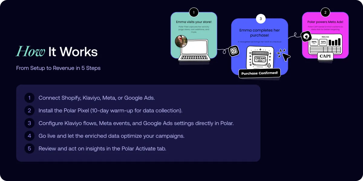
Polar already had the technical foundation. The opportunity was reusing it for a new use case: not analytics, but activation. The mechanism came together as five parts.
01
Server-side pixel
Embedded via the Shopify App Pixel framework, bypassing ad blockers and respecting Shopify consent settings.
02
Identity graph
Cross-device stitching of anonymous sessions back to known, consented users via deterministic and probabilistic tracking.
03
Flow cloning
Duplicates existing Klaviyo flows under new event names. Zero disruption to the original pipeline.
The remaining two parts: net-new enriched events sent back into Klaviyo without touching the original setup, and performance tracking inside Polar's dashboard showing 20%+ revenue gain on average, with cart abandonment lifts of 50%+.
How it works: server-side pixel → identity graph → cloned flows → enriched events back into Klaviyo
Built for ecommerce marketing managers, email marketers, paid and growth marketers, founders, and agencies, particularly those already using Klaviyo who were seeing unexplained drops in flow performance.
07 — Competitive landscape
Most email tools were good at sending. None could see what was happening. The Enricher's differentiation wasn't sending more emails. It was capturing the signals competitors had silently lost.
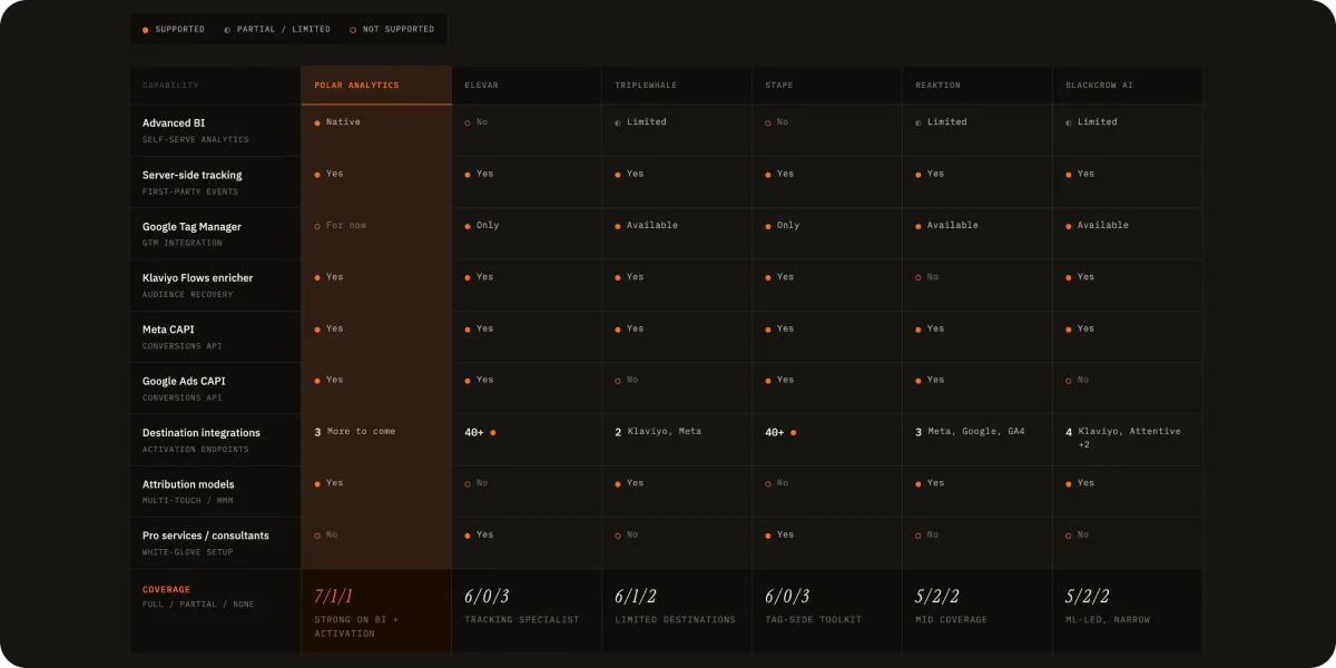
Competitive matrix: Polar vs Elevar, TripleWhale, Stape, Reaktion, BlackCrowAI across 9 capabilities
Three things separated Polar from the established players.
Server-side tracking + identity graphTable-stakes server-side wasn't enough. The cross-device stitching is what recovered the lost 60–70%.
Native Klaviyo flow cloningCompetitors required brands to rebuild flows or change their existing Klaviyo setup. The Enricher preserved everything.
Polar's BI coreOnce enriched data flowed through Klaviyo, it also fed back into Polar's analytics, making the whole platform smarter.
08 — Design principles
Four principles shaped every screen.
01
Show life before results
Let users see the feature is working, even when no data is visible yet.
02
Frictionless setup
Only show what's needed to get started. Keep it simple, focused.
03
Connect to unlock
Make it clear that connecting data is what activates the value.
04
Explain with clarity
Plain language and simple visuals over technical precision.
09 — Iteration
First drafts that didn't make it.
Working through the formula display
An early version tried to show users the exact uplift calculation. It got too complex too fast. I dropped the precision in favor of transparency. A clear "this is what we recovered" without exposing the math behind it. Information isn't useful if it's complicated.
Working through the chart type
The initial dashboard used a line chart to show Polar's recovery vs. Klaviyo's baseline. Bar charts read more clearly. At a glance, you can see "Klaviyo got these emails, Polar got those plus more." Line charts implied continuity; bar charts implied capture.
Working through the entry point
The first version surfaced the feature as a modal during onboarding. I moved it to a dedicated page so users had room to understand what they were activating, not just click through.
Working through scope
The initial MVP was Klaviyo-only. After early customer wins, I expanded scope to include Meta CAPI and Google Ads CAPI in the same setup flow.
Rejected first drafts: formula complexity, line chart, modal entry, Klaviyo-only scope
10 — User flow
Five surfaces shaped the end-to-end experience.
Sign-up goal selection
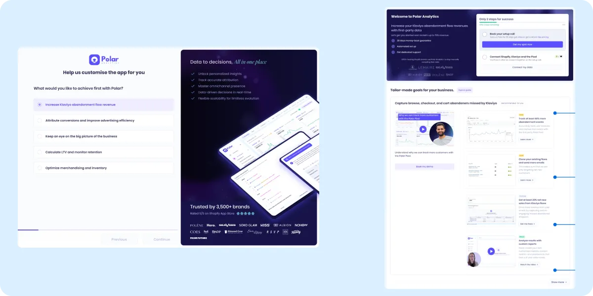
During onboarding, I surfaced "Increase Klaviyo abandonment flow revenue" as one of the primary goals users could select. Choosing it immediately oriented the entire experience toward the Enricher, avoiding a cold start and making the product feel personalized from the first screen.
Sign-up goal selection: orienting the entire experience around the Enricher from the first screen
New customer onboarding
Polar runs a free trial, which multiplied the number of user states the design had to handle. Every screen needed to work for someone in any of these states.
Not signed up, viewing demoGate with value-first framing.
Signed up, not paidUpgrade prompt at the right moment, without blocking exploration.
Paid, not connectedClear next-step CTA to install the pixel.
Connected, waiting ramp-upThe milestone journey (see below).
Existing userDifferent entry, same setup flow.
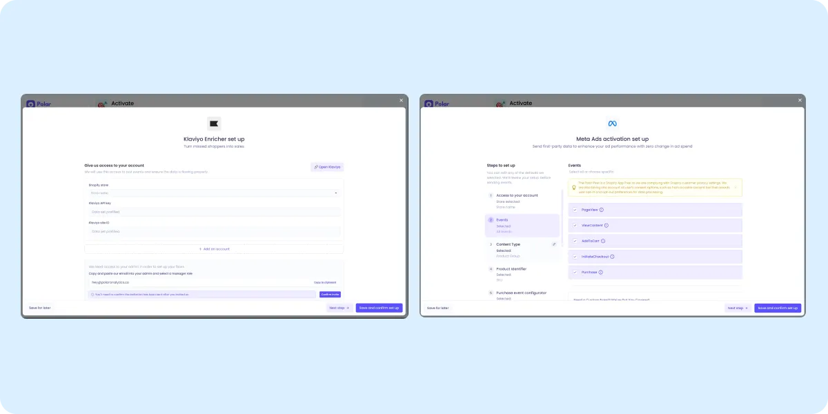
Onboarding: initial Klaviyo-only MVP with state-aware screens
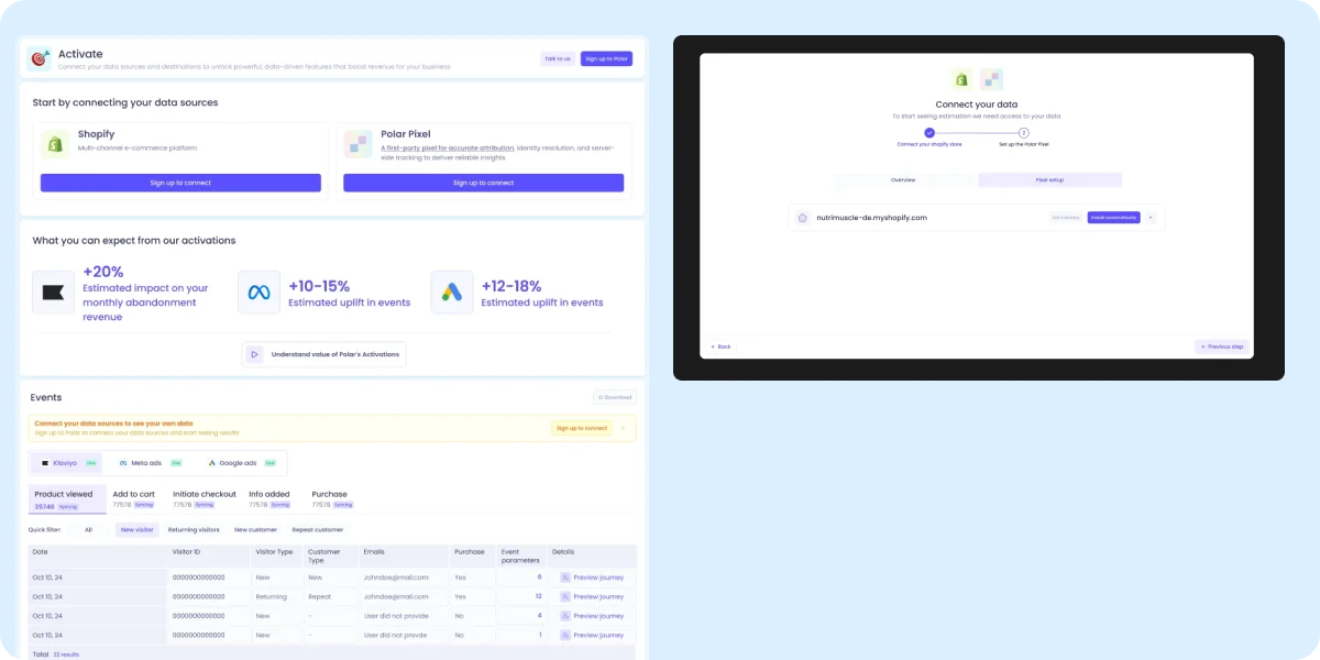
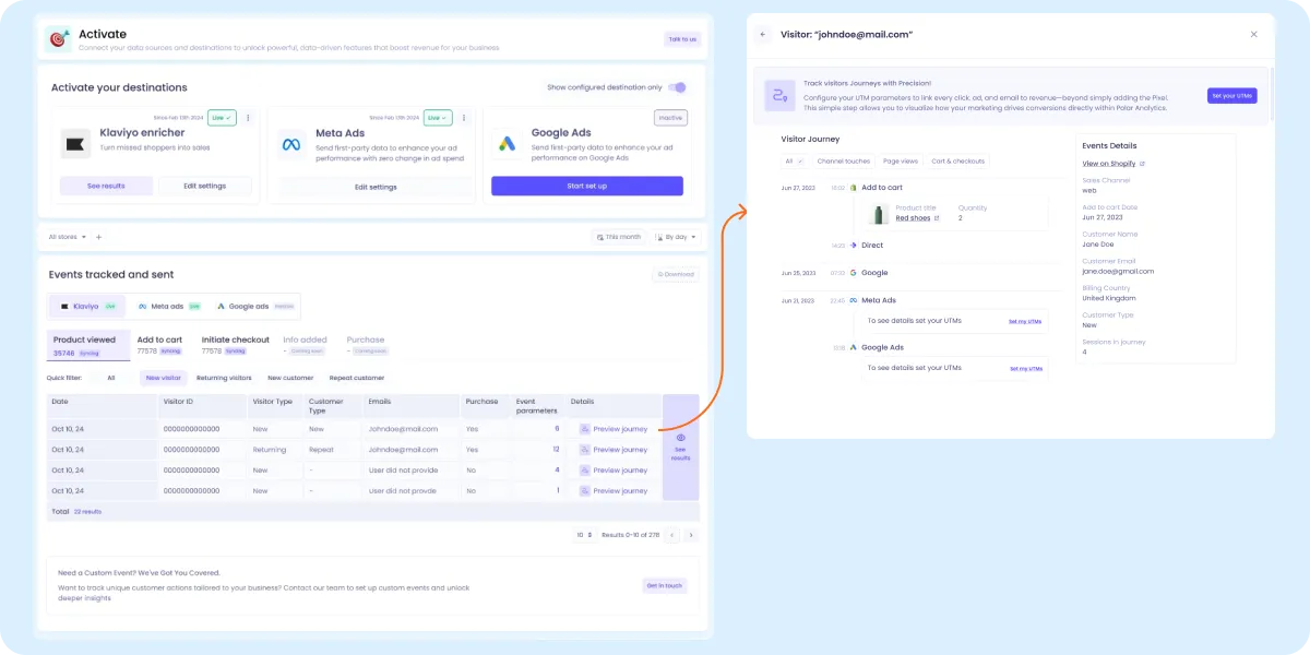
Setup flow
The setup walked users through three connections: Shopify, Polar Pixel installation, and destinations across Klaviyo, Meta Ads, and Google Ads. Each connection lived in its own step, with clear status indicators so users could pick up where they left off across sessions.
Setup flow: three sequential connections with persistent status indicators
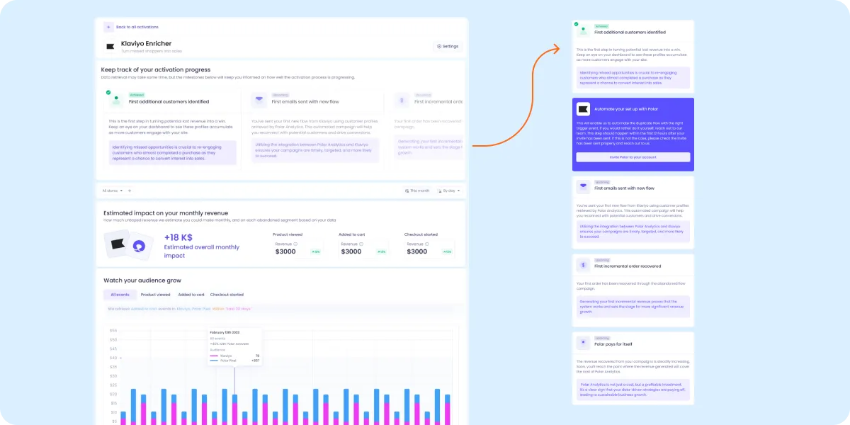
The milestone journey
The 10-day data ramp was the highest-risk moment in the experience. Users had connected everything, paid, and now had to wait. A blank dashboard or a generic loading spinner would lose them.
I reframed the wait as a milestone journey. Five concrete checkpoints with their own copy and context.
First customer identifiedThe system is alive.
Flows duplicated, automation liveThe pipeline is set.
First email sentTo a previously invisible shopper.
First order recoveredRevenue captured that Klaviyo missed.
Polar pays for itselfThe goal that made the case for the feature.
Milestone journey: turning a 10-day wait into five concrete checkpoints toward "Polar pays for itself"
Results page
Once data flowed, the results page showed recovered revenue clearly: a top-line number (extra revenue from the Enricher) and a breakdown by flow type (browse, cart, checkout). The table had to handle multiple states: no data yet, partial data, full data, comparison view, without overwhelming a non-technical user.
Results page: recovered revenue with breakdown by flow type, designed to handle multiple data states
11 — POC + early launch
The 5-customer POC ran in parallel with design and implementation. By the time the MVP shipped (a simple in-app landing showing the value proposition), we had real customer data showing the mechanism worked.
What validated the bet:
5/5 beta customers saw measurable revenue liftWithin the first 30 days of going live.
Zero pipeline disruptionNo impact on existing Klaviyo flows.
What surfaced repeatedly in customer conversations: privacy anxiety. Users worried we were sourcing or emailing people without consent. This sharpened the messaging significantly. I made first-party data provenance explicit at every touchpoint, and reinforced that targeting only applies to users who had already consented to receive marketing from that brand. The privacy concern became the basis for the GDPR/CAN-SPAM compliance framing across the marketing site, sales deck, and in-app help.
The MVP results greenlit a full launch with self-serve onboarding and an upgrade path.
12 — Marketing & sales
The feature could stand on its own commercially. I designed the complete go-to-market.
Independent landing page
For outbound, I built an independent landing page using a warmer, more direct-to-consumer aesthetic rather than Polar's analytical SaaS tone. The Enricher could be sold without first explaining what a BI platform is.
Independent landing page: warmer DTC tone vs Polar's analytical SaaS core
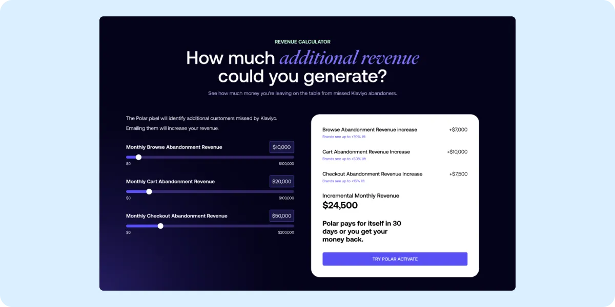
Revenue calculator
A standalone tool where brands could input their monthly abandonment figures across browse, cart, and checkout, and see a projected uplift estimate. It closed with a guarantee: Polar pays for itself in 30 days, or your money back.
Revenue calculator: projected uplift from real abandonment inputs, closed with a 30-day guarantee
Ad variations
Multiple ad formats targeting different angles: the privacy crisis, the recovered revenue, the speed of setup. Designed for Meta, LinkedIn, and blog placements.
Ad variations: three angles across Meta, LinkedIn, and blog formats
Post-demo sales deck
A follow-up deck for sales conversations after the 30-minute demo. Deeper proof points: real customer revenue numbers, before/after Klaviyo flow performance, for deals where the demo alone wasn't enough to build conviction.
Post-demo sales deck: deeper proof points with real customer data
13 — Performance
$2M
Revenue recovered (Jan alone)
$68K
Upsell over 9 months
20%
Steady adoption rate
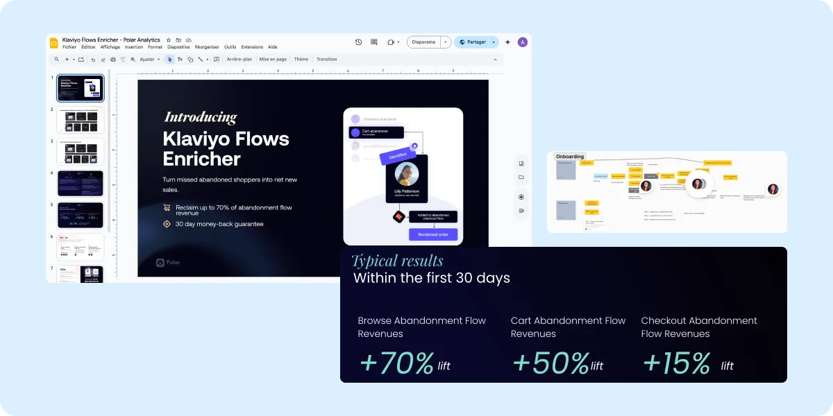
+70%
Browse abandonment
+50%
Cart abandonment
+15%
Checkout abandonment
Brands using the Enricher recovered over $2M in incremental revenue in January alone, from shoppers Klaviyo had missed entirely. The feature helped close several 6-figure deals by creating a clear competitive edge against Elevar, TripleWhale, and Northbeam.
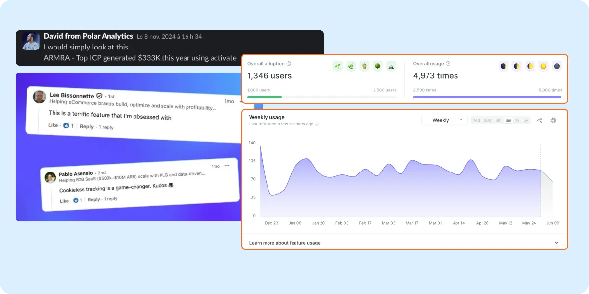
Activate is core functionality that gives us very solid footing in competitive discussions with TW, Northbeam, Elevar. Without it, we wouldn't stand a chance in these discussions.
MarinaDirector of Sales · Polar Analytics
Sandbox — Experiments
Side projects
Field notesMedium · 2025–2026
cmd_aliceThis portfolio · 2026
StrataProduct concept · 2025
Side project · 2025 · Solo exploration
Strata
"What's tracked, what's broken, and where."
A side project I used to practice identifying a real problem in a space I kept bumping into: product analytics governance. From competitive analysis to interaction design, the goal was to explore what a better solution could look like.
Everyone has the same problem. Nobody has solved it well.
I kept noticing the same pattern in conversations with data engineers and product teams: their analytics stacks were solid (Amplitude, Segment, solid pipelines), but the meaning layer had collapsed. Events accumulated faster than anyone could document them. Tracking plans were always out of date. Nobody knew which events were still alive.
The interesting part: this wasn't a tooling gap in the obvious sense. The tools existed. They just all made the same wrong assumption.
Any governance system that lives outside the product will drift from it. The question isn't "how do we get people to maintain the plan?" It's "why does the plan need maintaining at all?"
That reframe is where the project started.
02 — Identifying the pattern
It's not a discipline problem. It's an abstraction problem.
I mapped the common failure arc. It follows the same shape almost every time:
Y1
Small team, one naming convention, Notion plan works fine. Everyone trusts the data.
Y2
Second and third squad added. Each brings their own naming convention. Nobody has time to reconcile. Plan starts drifting.
Y3
~40% of events are orphaned, deprecated, or never referenced in any dashboard. A PM makes a decision on a deprecated event. Nobody catches it for weeks.
Fix?
Team evaluates a governance tool. Codegen or plan-approval flow blocks devs. Engineering refuses. Tool gets shelved. Problem continues with an added layer of frustration.
The root cause isn't that people aren't disciplined enough to update the plan. It's that the plan is the wrong unit. A document that needs to be manually kept in sync with a shipping product will always lose.
03 — Looking at what exists
What the existing tools get right. Where they stop.
I did a structured look at the main players: Avo, Amplitude's visual labeling, Mixpanel's lexicon, and a few internal tracking plan setups teams had shared. Each has a genuine strength. Each has a ceiling.
Avo
Strong on plan structure and Codegen type safety. Breaks down when the Codegen workflow creates a pre-ship dependency that engineering won't accept. Without Codegen, you lose most of the value. The branch model adds complexity that non-technical profiles struggle with at scale.
Amplitude
Visual labeling lets non-technical users annotate events, but it requires auto-capture, and in practice designers annotate inconsistently. "Anyone can label" creates more noise than structure. Good for discovery, problematic as a governance layer.
Notion
Every team starts here. Works until year two, then becomes a liability. A plan that's confidently wrong is worse than no plan at all. The ops cost of keeping it current grows faster than the team's willingness to pay it.
The gap I was drawn to: none of these tools start from observation. They all ask you to define what should exist before looking at what does. That sequencing is backwards for a product that's already in production.
04 — The design hypothesis
Observe first. Govern after.
The core idea I wanted to test: what if you started from the product as it actually exists in production, and built the semantic layer on top of observed reality, rather than asking teams to maintain a document that describes what they intended?
This led to six concrete design decisions.
01
No plan to maintain
The product is the source. No separate document drifts from reality.
02
Descriptive before prescriptive
Show what exists first. Define what should be later, if at all.
03
Devs ship freely
No pre-ship dependency. No PR blocker. The system observes, doesn't gate.
04
Context from the product itself
Section, journey, feature — meaning emerges from how events are used.
05
Health visible at every level
Orphan, deprecated, unused, duplicate — surfaced as visual state on every node.
06
Plugs into existing stack
Sits on top of Segment, Amplitude, Mixpanel. No replacement, no migration.
The metaphor I kept coming back to: a product map, not a tracking plan. Maps show you where things are. Plans tell you where they should be. For a product in production, the map is what you actually need.
05 — What I built to test it
A working prototype and a landing page, as a thinking tool.
I built enough to make the concept tangible and pressure-test the ideas. Not a shipped product. A medium-fidelity exploration designed to surface the hard questions early.
Semantic zoom prototype
Four-level interactive map
Product sections, user journeys, feature interactions, raw events. Each level reveals more detail. Analytics health (orphan, deprecated, unused, duplicate) visible at every depth. Built to validate the "map over plan" navigation model.
Health layer
Event status at a glance
Five statuses (active, orphaned, deprecated, unused, duplicate suspect) surfaced as visual indicators on nodes, journey cards, and event cards. Designed to make analytics debt visible without requiring a separate audit.
Landing page
Proposition + animated demo
Full landing with FR/EN toggle, an animated scan visual in the hero, an interactive six-needs section, comparison table, and an embedded live demo. Built to validate the value proposition language with a real audience.
Competitive framing
Positioning against Avo & Amplitude
Worked through a structured comparison based on real feedback from a data engineer actively evaluating these tools. Used to sharpen the differentiation and avoid positioning traps (e.g. "better tracking plan" vs. "semantic layer").
→The hardest design problem wasn't the UI. It was the right unit of meaning. What is the right level of granularity for a "product context"? Feature? Screen? Flow? Getting this wrong makes the map either too coarse to be useful or too granular to maintain. I landed on Feature → Flow → Interaction, but I'm not confident this is universal.
→The semantic zoom metaphor worked better than expected as a design constraint. Forcing every piece of information to exist at a specific zoom level meant I had to make hard decisions about what belongs where. That constraint produced a cleaner information architecture than I would have reached by starting from a dashboard layout.
→"Descriptive before prescriptive" is a useful principle beyond this problem. The instinct in most governance tools is to define the right state first, then enforce it. Starting from observation and exposing divergence is a less confrontational model, and probably more adoptable in practice.
→The real competition isn't Avo. It's the spreadsheet. Most teams won't migrate from a spreadsheet tracking plan to a dedicated tool unless the activation cost is near zero. Any solution that requires setup time, a migration, or a workflow change will be abandoned before it delivers value.
Side project · Portfolio · 2026
cmd_alice
This portfolio is itself an experiment. Rather than a landing page, simulate a lightweight OS. Windows, a dock, an interactive terminal. The interface becomes the argument.
HTML · CSS · JSInstrument SerifIBM Plex MonoDark modeSingle file
The portfolio is the case study. A system, a rationale, an opinion. Same process I bring to everything.
Constraints
Single HTML file
No frameworks, no build step. Full control.
Dark mode only
Single primary medium. Mobile is a teaser.
~140KB total weight
Performance as a value.
Vanilla CSS, no component library
At this scale, naming beats abstraction.
cmd_alice / Design System
The portfolio runs on a token system: 33 color tokens organized in 4 semantic groups, 3 type families, a 7-step spacing scale, plus a small set of conventions and exceptions documented below.